Lifestyle | Wellness | Editorial
Martha
Stewart Living Omnimedia
ART DIRECTOR
The Martha Stewart Living omnimedia brand created cross industry impact through a re-imagining of everyday life made beautiful. Through engaging story ideas, stunning editorial visuals, and photography, the pioneering company anchored the brand with the magazine as their key brand product and repurposed content through a multi-channel funnel of books, broadcast, digital and SIP’s many of which created new industries such as the wedding industry, the home cook, and DIY crafting. We paved the way for the digital content creation industry and channel activation. The brand centered around lifestyle content, gardening, entertaining, cooking, weddings, DIY crafts, homesteading and wellness content pillars. As part of a team of legendary stylists, creative directors, and photography editors, I created an overall visual direction for a new sub brand of the omnimedia company focused on wellness.
Taking organic lifestyle content from crunchy to chic and desirable, we created a space in the wellness industry that was elegant and beautiful. We created an aesthetic that represented a new kind of lifestyle, one that is highly replicated and sought after today in the wellness industry. This design strategy created a multi-publication cross over reader.
I took the team through two redesigns which started on the brand level and filtered down into the signature magazine.
Brand Development
Style Direction
Branding
Art Direction of photography (Still, Motion)
Editorial design
Magazine Redesign
Content Creation
Craft Styling
Design Strategy
Typography
Production
Prop Styling
Illustration
Project management
People management
Core brand content areas
Our background in editorial content creation is at the heart of every brand development project.
Whether you are selling a singular product or a lifestyle, brands are content creators following an editorial model, providing expertise, creating community and conversation, and becoming a part of a customer’s life ecosystem. No matter how big or small your brand is, decide what areas of content your brand will be associated with.
The model Martha Stewart created was every content area or repeating column in the magazine could become a book of it’s own year after year.
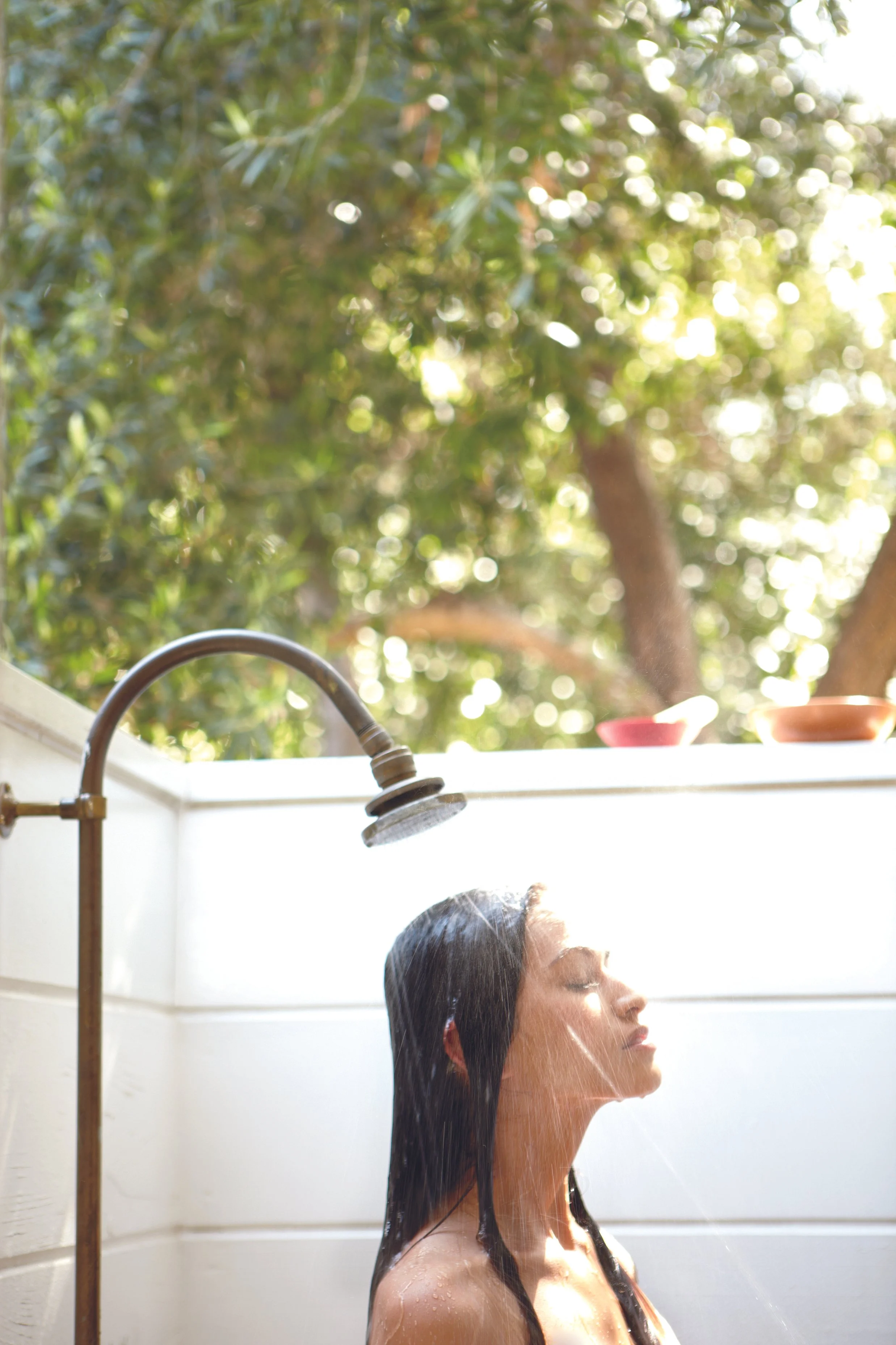
Building off of the MSL lifestyle content model, Whole Living addressed the same key content but through a wellness lens. It was important brand wise to have content that covered wellness holistically through many aspects reinforcing the larger brand’s mission of “making life beautiful.”


How To

Inner Growth

Products

Fitness

Lifestyle
Food

Beauty
Brand Photography
Photography is the most powerful way to give a brand an ownable visual language.
Our expertise in photography comes from years of being “on set” working in a variety of photographic situations. Selecting the right photographer and crew for a brand is an art director’s number one tool. Knowing how to develop a photoshoot with a clear vision including set, location, lighting, and styling is the craft of art direction.


Lifestyle

Still life

Modern studio
Photo documentary
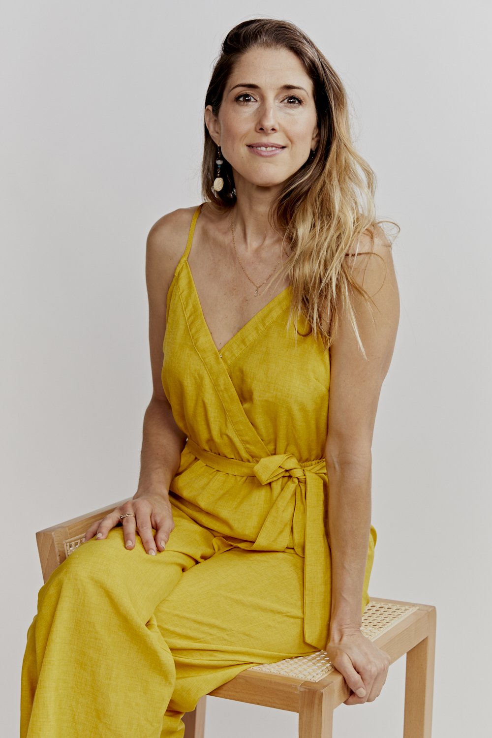
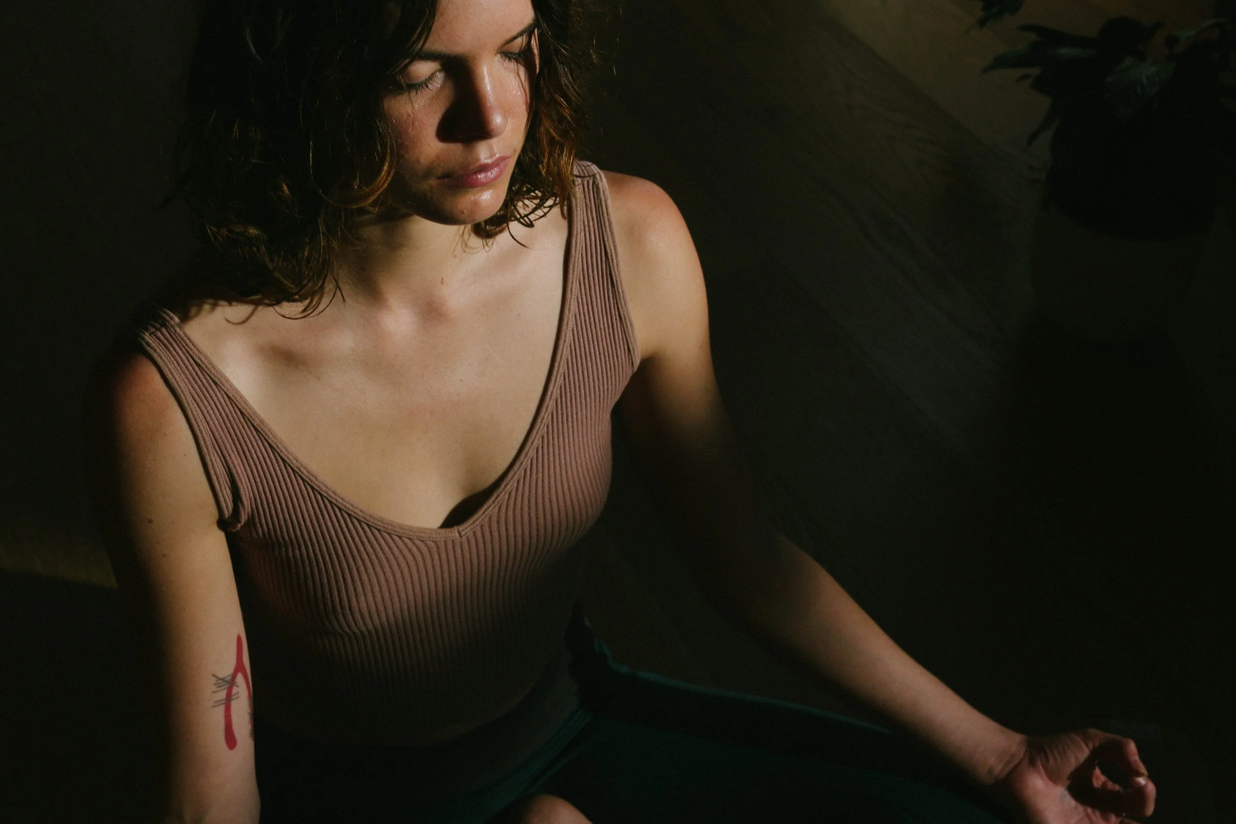
Style Direction
Our expertise lies at the intersection between art direction and style.
God is in the details. The power of styling cannot be underestimated. We style with all of our senses, always looking for ways to bring forth the sensory details of a product, person, and environment.
I worked under the direction of MSO style director, Ayesha Patel, pulling props and wardrobe from small, organic labels and artisans.

Typography
Brand typefaces reflect your brand voice.
We work with everything from bespoke typefaces to google fonts. We are persnickety about their implementation and how they are handled. The process of choosing brand typefaces is a highly researched and selective process. There are many factors to be considered: readability, application, display versus body copy. We work with type foundaries from Copenhagen to Austin and everywhere in between to find the best expression of letterforms for your brand.
For Whole Living, we took an existing typeface and redrew it as an ultra thin version for our main display face to modernize and lighten the texture of the brand.

Color scheme
Color is our most primal sense and we take it seriously (and playfully).
Our approach to color for the Whole Living brand was issue by issue and in response to the season. A color direction was established using physical objects and tear sheets.


Magazine Redesign
We’ve redesigned over 30 magazines.
It’s an art, it’s messy, it’s a rare expertise these days. Magazine designers are some of the best designers in my opinion. The right mixture of experience working with complex typographic systems and the nitty gritty, to art directing photography feature stories with a point of view, all with fast paced production skills.

We build a library of cohesive brand assets for you to populate on all of your channels.
We are strategic storytellers. We think of stills as movies, and movies as stills. We develop stunning hero images, and value packed supporting images all consistent to your brand language. We curate all the parts and pieces (wardrobe, talent, prop, location) to our utmost standards.
When working in an editorial setting, a blend of photography styles support different types of content and visual diversity within the magazine. I worked with a variety of photographers learning best practices of art direction and how to get the best from working with photographers on set including, Gentl and Hyers (still life), Craig Cutler (beauty), Johnny Miller (in-house), John Dolan (lifestyle), Mitchell Feinberg (still life studio), and Ditte Isager (food).
Art Direction of Photography


Lifestyle | Wellness | Brand Development
Spyre
Wellness
CREATIVE DIRECTOR
Situated in the lower garden district of New Orleans, Spyre is a centralized space for the community to foster whole-body wellness through education, healing therapies and respected integrative and alternative practitioners. The former Norwegian Seaman’s Church designed by mid-century modern Norwegian architect, Nils Erling Hansen, turned inclusive urban sanctuary, houses the former chapel turned community gathering space, former sailor lodging rooms into practitioner treatment rooms, EMF free meditation rooms, a cafe, hot + cold plunges, a sauna, and meditation gardens and a labyrinth.
A full scope project that included everything from research and development, space planning, naming, programming of services, interior styling, energetic clearing, art direction of photography, UX design, launch, and application of biophilic principles.
Brand Development
Messaging
Naming
Programming of Services
Interior Styling
Furniture Design
Crystal griding
Branding
Print design
UX Design
Website Design
Design Strategy
Typography
Art Direction of photography
(Still, Motion)Prop Styling
Illustration
Project management
People management
Brand Development
We took the client through a brand development workshop to get crystal clear on their reason to be, their mission, and their vision. Located in diverse New Orleans, it was important to the client that the center be accessible to all of New Orleans’s residents.
The idea of a one stop shop was born from a personal experience one of the founders had while on a health journey: driving all over town to receive physical and emotional support while ill was time consuming and draining.
The idea that the full mind/body/spirit could be supported under one roof became a differentiating factor amongst competition, regionally and nation wide.


The Zone

The Well
Cafe

The Health
Collective

The Nave

The Soul
Center
Color
Scheme
Our eyesight evolved with plant life. Green is the first color our primate eyes saw. Looking at the color green creates a level of homeostasis in the body.


Photography
Art Direction


Client List